Visitors rarely notice the details that work. They notice the ones that don't: a highlight that jumps, a hover that only covers half a row, a card that says "Not shared yet". This week I went through this site looking for exactly those moments.
None of the fixes were big. Together, they changed how the site feels to use. Here is what I changed and why.
Start with a list of small frictions
Before touching anything, I clicked through every page and wrote down each moment that felt slightly off. No solutions yet, just observations:
- The dock's active pill jumped between tabs instead of moving.
- On the home page, clicking a tab made the pill stop on every section the page scrolled past.
- The hover on article rows dimmed the other rows but gave the hovered one nothing.
- The About page had placeholder cards and icons made from single letters.
- The hero banner was a nice contour map, but it said nothing about where I work.
Writing the list first kept me from polishing whatever I happened to be looking at. It also made it easy to see which problems shared a cause.
The dock: motion should explain where you are
The dock highlights the section you are in. Before, the highlight measured its target before the new label had grown, so it aimed at the wrong size and the icons shifted under it. Now the pill, the icons, and the labels share one spring, so they move together as a single animation.
The second fix was about intent. When you click Insights from the top of the page, the page scrolls past Projects on the way. The pill used to follow every section it passed. Now it goes straight to what you clicked and stays there until you scroll yourself.
Motion is feedback. If it moves, it should tell people something true about where they are.
For anyone curious, the spring is deliberately stiff and well damped, so it settles quickly without bouncing:
const DOCK_SPRING = { type: "spring", stiffness: 500, damping: 38 };
Hover states should reward the thing you point at
The article list dimmed every other row on hover, which drew attention away from the list without adding anything to the row you were on. The new hover gives that row a soft surface, brightens the title and date, and slides in an arrow that says "this opens".
The same row is now a shared component, so the home page, the Insights page, and the related insights on case studies all behave the same way. One pattern, learned once.
Cut what doesn't earn its place
The old About page opened with a grid of cards. Two of them said "Not shared yet", one repeated the clock that already sits in the footer, and the tool icons were letters standing in for logos.
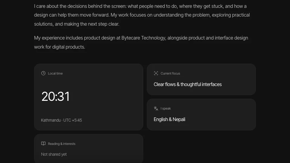
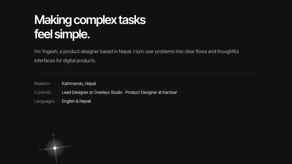
The new version keeps one intro paragraph and three facts. The "Currently" line comes straight from my experience data, so the About page and the timeline can't disagree.
| Detail | What felt off | What changed |
|---|---|---|
| Dock pill | Jumped and stopped on every section | One shared spring; holds the clicked tab |
| Article rows | Hover only dimmed the others | Surface, brighter text, and an arrow |
| Experience | Bright coloured initials, loose spacing | Neutral initials; list went from 512 to 436 px |
| About page | Placeholder cards and letter icons | One intro, three facts, plain tool list |
Give the hero a sense of place
The banner is now a halftone drawing of the Himalaya as it lines the northern horizon from the Kathmandu valley. The far ridge uses real peaks, from Dhaulagiri to Kangchenjunga, at their real relative heights.
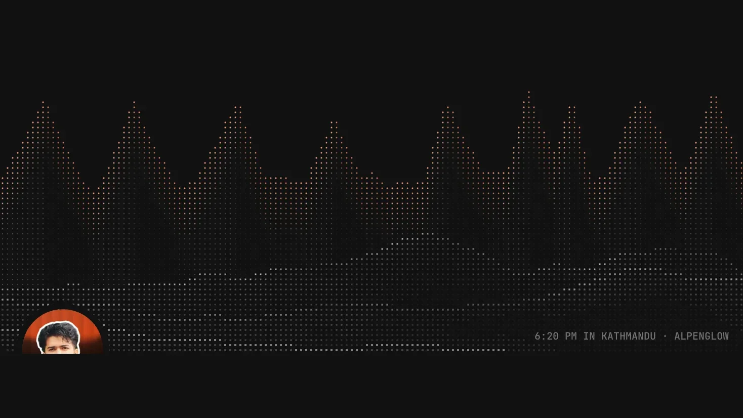
It follows the actual time in Nepal. Around sunrise and sunset the summits glow orange, during the day the light shifts across the peaks, and at night stars come out. Pointing at a peak names it, and clicking sends a gust of wind through the ridges.
It also had to stay light. It draws a few thousand dots per frame and holds a steady 60 frames per second, pauses when it scrolls out of view, and stays still for people who prefer reduced motion.
What I would tell myself next time
- List the frictions before fixing any. Patterns show up that one-off fixes hide.
- Make motion carry meaning. If an animation doesn't explain a change, it is decoration.
- Prefer one shared pattern over three similar ones that drift apart.
- Delete placeholders. An empty card says more about the site than about you.
- Test the boring cases: keyboard, reduced motion, small screens, and no JavaScript.
None of these are new ideas. The work was in noticing where this site ignored them, and fixing those few places carefully.